My magazines adheres and challenges to many conventions of music magazines throughout the 3 pages I created.I tried to follow as many as I could to make my magazine appeal to my target audience .
Front Cover:
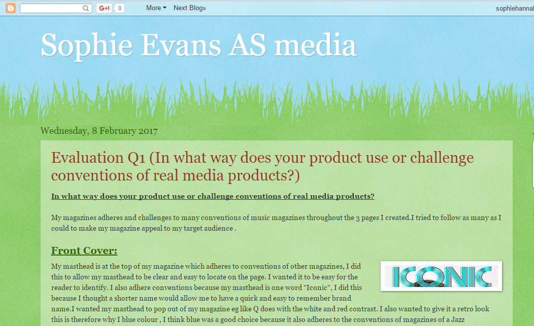
 My masthead is at the top of my magazine which adheres to conventions of other magazines, I did this to allow my masthead to be clear and easy to locate on the page. I wanted it to be easy for the reader to identify. I also adhere conventions because my masthead is one word "Iconic", I did this because I thought a shorter name would allow me to have a quick and easy to remember brand name.I wanted my masthead to pop out of my magazine eg like Q does with the white and red contrast. I also wanted to give it a retro look this is therefore why I blue colour , I think blue was a good choice because it also adheres to the conventions of magazines of a Jazz genre.However, I have challenged conventions with my masthead because it is 3D, many jazz magazines which I researched used 2D fonts instead of 3D. I chose to do a 3D font because I wanted my magazine to stand out from the rest of Jazz magazines which are available.
 The cover story also adheres to many music magazines because it is the boldest and biggest on the page , I did this so it was clear to the reader which was the main article.I also used a buzz word 'exclusive' which would gain more attention to the main article, this challenges conventions of other jazz magazines I researched because not many Jazz magazines have this words on their front covers however, in the context of music magazines together it does adhere to conventions.
 The other articles are spread on each side of the page in smaller writing in red, this adheres to conventions because many magazines have the articles smaller than the main.However, I have challenged conventions by having the features in the same font. The size of the fonts were mostly the same . I have also included a section on the on the Jazz awards , I did this to attract a more older audience 20-21 who would be more interested to vote.
I have also included a sell line , I did this to make my magazine more appealing to the audience , this challenges many jazz magazines because they don't this. I have placed it at the top of the page to create more effect because its near the masthead it is automatically seen by the buyer this helps convince more people to buy my magazine and helps the brand to be associated with it more.
 I have also used a competition to help draw the reader to the magazine this adheres to conventions because many jazz magazines have them.I have also used social media logos on the front of my magazine to appeal to my target audience, this challenges many jazz magazines conventions because it is not normally shown.
The biggest challenge to convention I have on my front cover is the cover image, the star is not looking into the camera which breaks any music magazines conventions , I did this to give my star attitude. I also used a colour pop on the artists lips to make them stand out and I used this colour to create synergy with my magazine.

Contents :
In my contents page I have used the same colour font for the contents page title as the iconic masthead. I did this to create synergy within my magazine this normally adheres to conventions in magazines. I have also used lines by the side of the contents title to make it bolder and stand out more this also challenges conventions of magazines . I have placed this in the middle of the page at the top to draw more attention to the meaning of the page help . I have also used headings such a 'cover-story' ; ' features' and 'regulars' this is to help the readers and help organise the contents in the magazine. This challenges conventions of jazz magazines because it is not normally done .

I have placed the page numbers in blue boxes which I did to create more synergy this follows conventions of jazz magazines because many jazz do this to make the numbers more bold and to help the reader.
 The page titles are in a bigger font than the description to help readers identify what they want to read this adheres to conventions to many music magazines. The description has been placed underneath (if it was needed) in a smaller font . I have also used sans serif for my contents which is adheres to the conventions of jazz magazines .
 I have used 4 images on my contents , these are not texted wrapped which breaks conventions of jazz magazines. On my cover-story image on the contents the star is pictured with a dog, this challenges several conventions such as having the dog in the image breaks many conventions in music magazines . Also it challenges conventions because she is not looking into the camera just like the cover image. The other images also challenges conventions because the artists don't look into the camera.
This image adheres to conventions because the star is holding an instrument which many jazz magazines like the stars to pose with.
The images also adhere because they are all studio shoots which are normally used in jazz magazines.
I have used mostly medium shots for the pictures on the contents page. I have also used a gig image this challenges conventions because most jazz magazines wouldn't include this on their contents however , I decided to do this to appeal to a more younger audience.
I have used mostly medium shots for the pictures on the contents page. I have also used a gig image this challenges conventions because most jazz magazines wouldn't include this on their contents however , I decided to do this to appeal to a more younger audience.
Double Page Spread:
 On the double page spread I have used a drop capital this adheres to the conventions of jazz , I did this to make my text more bold and add something bigger to the page. For the headline of the article I used serif font this also adheres to the convention of jazz.
The image on the double page spreads covers both sides however, the artist is just on one. This challenges conventions of jazz magazines because the image used is normally placed on one side of
 the article. The image I have used is a close up this is because her face is close to the camera however, this is because she leans into it, this is challenging conventions because of the shot type.The star looks into the camera to create a relationship with the reader and make the article more intimate, this adheres conventions in jazz magazines because they want the star to appear kind and friendly.

I have placed the page numbers at the bottom which adheres conventions of magazines I have also included the logo.
In the double page spread article I have used questions as headings this is challenges conventions, I did this so the reader could see the bit of the article which interested them the most, I have also used a consultative register this adheres conventions in magazines.
 I have also used a pull quote this is to give an insight into the article , this adheres conventions in jazz magazines . I have also done this to help bring more attention to the article and make it more intriguing.


